Colameco’s Primo Naturale has been a mainstay in Whole Foods for several years, but the packaging was simply dated as compared to the competition and, as happens with something that has been around a while, people had just stopped noticing it.
It was time for a refresh.
Third Street was engaged for a total brand overhaul which including logo, brand language, point of sale, colors, brand guides, packaging and promotional merchandising.
Logo
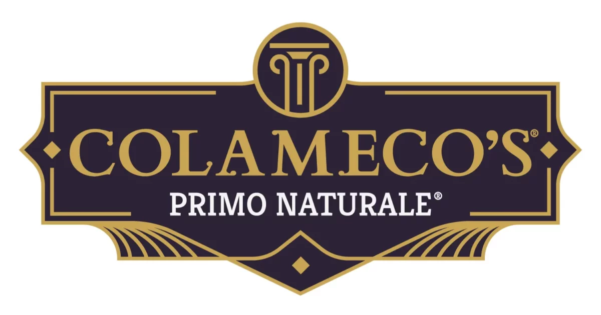
Crafting the Look
We found inspiration in Colameco’s family history going back generations in Italy.
We embraced the topography, the sunsets, the produce and even the family’s regional crest. Gold hues and royal Italian plumbs helped form this a new, premium look for Colameco’s.

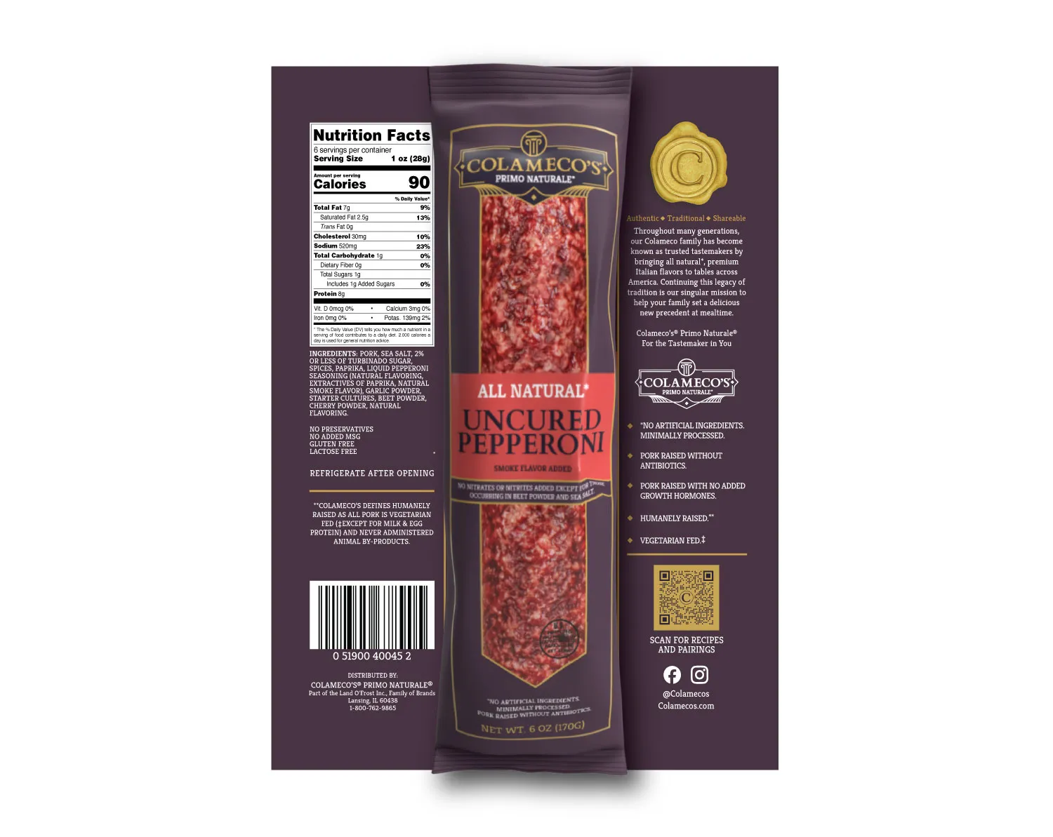
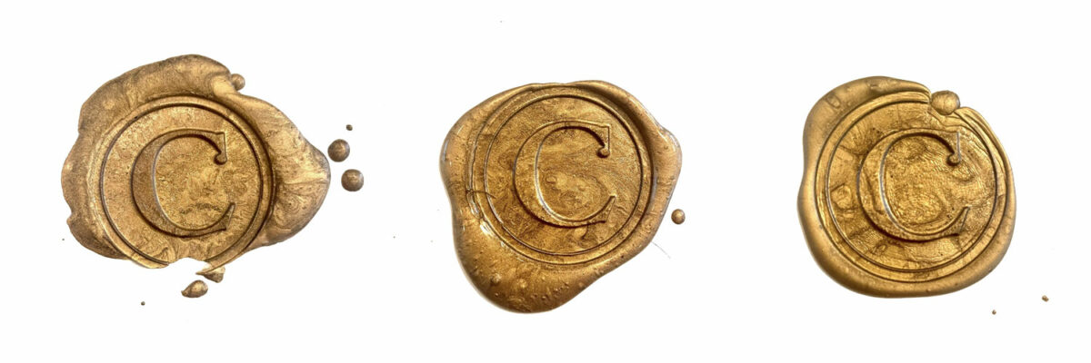
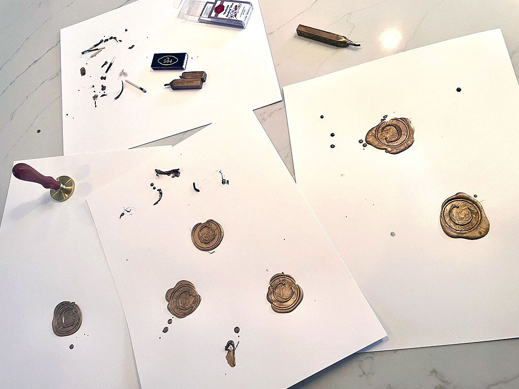
The Ultimate Wax Seal
The new Colameco’s brand needed a final element to emphasize that the product comes to the consumer from generations of the Colameco’s family. We decided on a golden wax seal icon with the family “C”. Of course, you can create this in photoshop quite easily, but we set out, attempt after attempt, drip after drip, to create the perfect real wax seal.
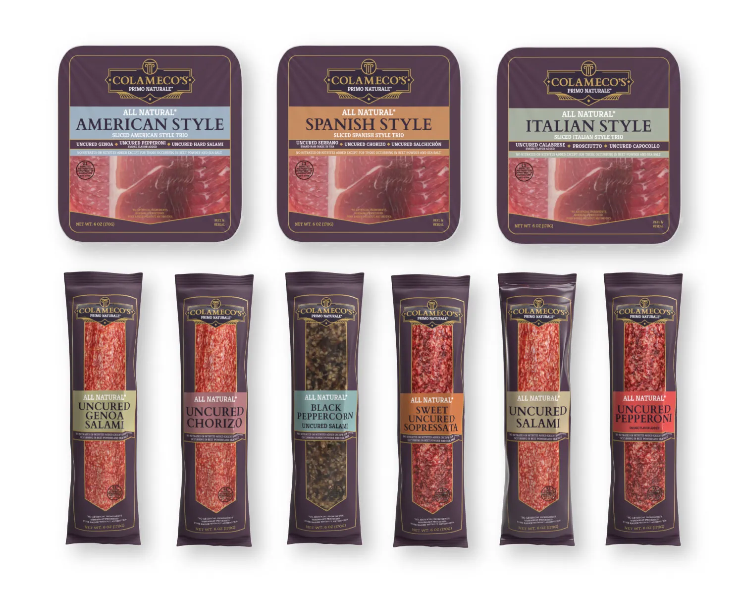
New Packaging
Across 9 SKUS, with several more still in development, Third Street redesigned all-new packaging for the entire line that spoke to the premium nature of the product and showcased its authentic quality. The result was an immediate increase in sales to record highs and new interest from other retailers to carry the line. Salute!